


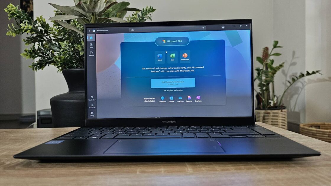
Today, Microsoft announced a new tier of its productivity subscription called Microsoft 365 Premium. And, with absolutely no surprise given the year we're in, the subscription is centered around AI. Microsoft 365 Premium replaces a plan the company previously offered, Copilot Pro, and the majority of features it offers are based on Copilot integration.
While the subscription might not sound all that exciting, especially to users who aren't particularly fans of AI features, one of the updates impacts everyone and is sure to grab attention: the classic Office icons are getting a colorful makeover.
Microsoft 365’s new icons bring a colorful, AI-powered refresh
Today, Microsoft announced that it's officially beginning to roll out refreshed icons for its core 10 Office apps. This is the first update to the icons since 2018, and the redesign brings a more colorful, modern look that reflects the AI-driven features now integrated across the suite. In addition to giving users a fresh visual experience, the updated icons are designed to highlight how Copilot integration is now a core part of the Office apps.
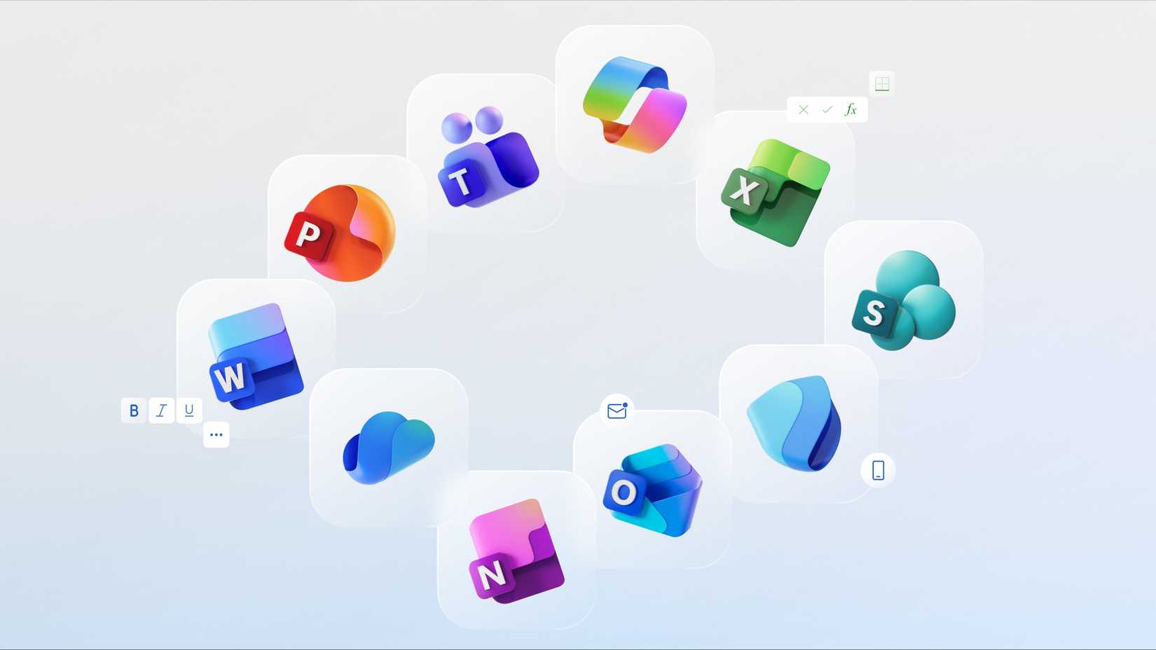
When Microsoft updated its Office icons back in 2018, the goal was to make the apps feel more connected and cohesive across different devices and platforms. This time around, the intention is to combine that sense of cohesion with a design that clearly signals the apps’ smarter, AI-powered capabilities. Microsoft is achieving this vision with a modern 3D-like look. Jon Friedman, the corporate vice president of design and research for Microsoft 365, explains:
Turns out, I wasn’t the only one who liked the new icons. There were plenty of people like me who didn’t want to wait. Given that there was also no guarantee the company would even release the icons as they were test icons users were giving feedback on, a Microsoft fan decided to take matters into their own hands. Someone on the Windows 11 subreddit cleaned up the leaked icons, doing all sorts of magic like downscaling, upscaling, cleaning, and even using AI tools to polish them into a complete, shareable set that fans could enjoy right away.
So, it's definitely a good thing that the company finally listened to user feedback and decided to officially roll out the refreshed icons. Similar to Google's new logo, Microsoft's new icons make the gradient design a lot more prominent and vibrant, designed to improve accessibility. The icons are also a lot more curvy this time around, with the sharp edges and crisp lines being replaced by smooth folds and curves.
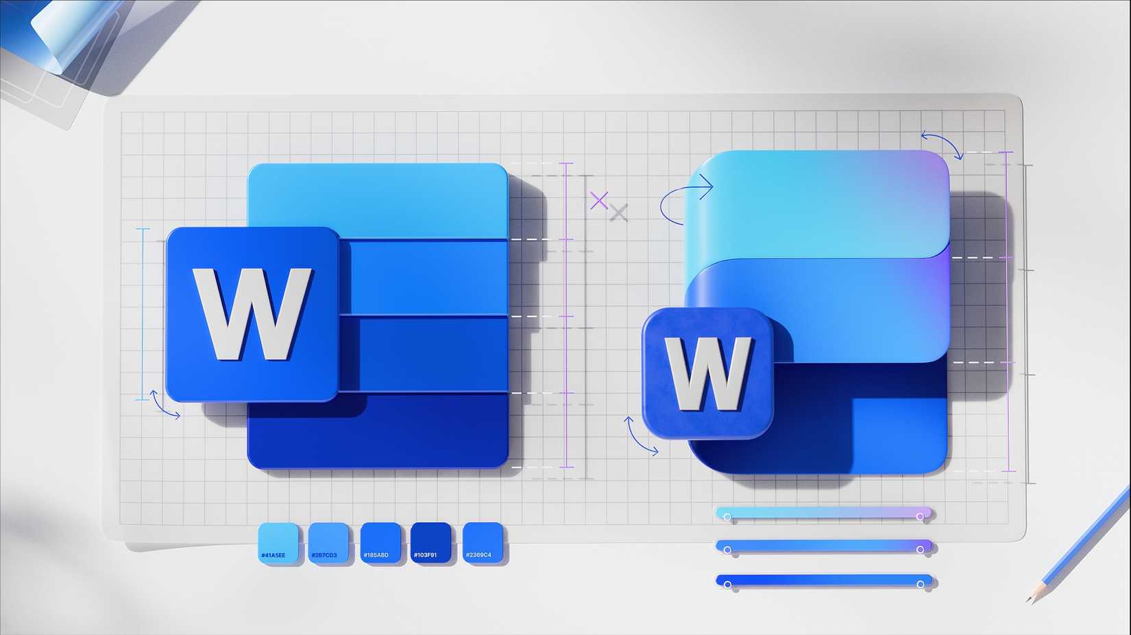
While I can see why everyone might not be a fan of the new icons, I personally dig the change. It's refreshing, and it manages to feel both modern and approachable without losing the familiarity that makes Office apps instantly recognizable. The new icons will begin rolling out in the coming week across web, desktop, and mobile. They will be available for both consumers and commercial users of Microsoft 365.